Brand & Consumer Insight | Featured Piece
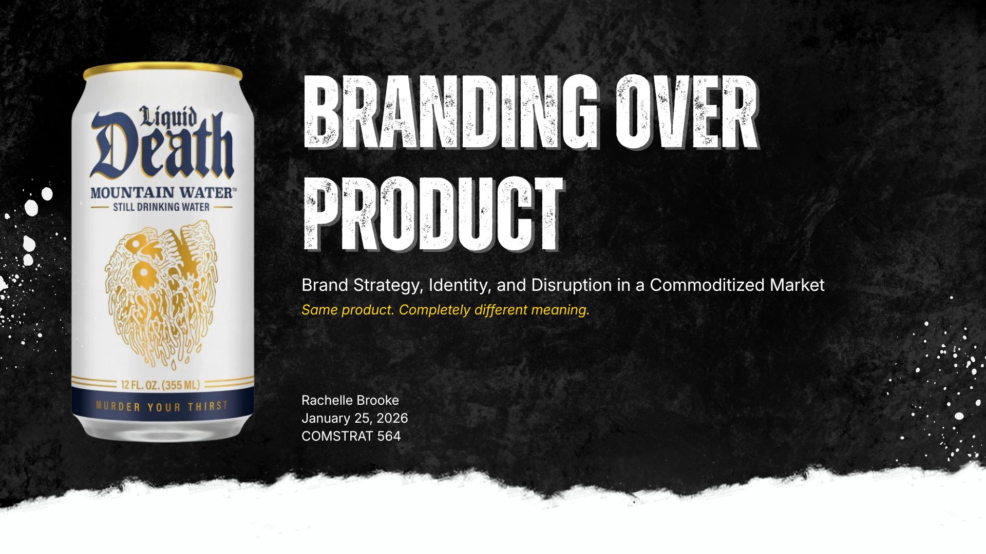
Brand Strategy, Identity, and Disruption in a Commoditized Market
Same product. Completely different meaning.


Spring 2026 | ComStrat 564: ‘Consumer Behavior and Brand Development’
“In a sea of ‘pure’ and ‘natural,’ Liquid Death chose to be loud, ironic, and unforgettable.”
Background
This piece came out of a brand-management case study assignment that asked us to select a brand and analyze how it built success in a crowded category. I chose Liquid Death, the canned-water brand built almost entirely on irreverent, heavy-metal-coded branding, because it’s one of the clearest real-world examples of a low-involvement, functionally undifferentiated product becoming a high-engagement brand purely through identity, tone, and cultural positioning.
The goal of the piece was to move past the surface-level “this ad is funny” reaction and actually analyze why the strategy works: what specific market conditions made the brand’s disruption possible, how its strategy and identity are intentionally aligned, how its communications reinforce that identity across every channel, and where its innovation actually lives (since it almost certainly isn’t in the water itself). I built the entire deck around brand-management theory from the course textbook (Sullivan, 2023) and tested that theory against current reporting and case write-ups on the brand.
Scope
In regard to case research, I looked to understand what fueled the brand’s initial success, how important brand identity was to that success, how the product compares to the brand as a value driver, my own take on the brand’s deliberate use of controversy, who the brand’s audience actually is versus who you’d assume it is, and what a “traditional” bottled-water offering even looks like by comparison.
From there, I went to secondary research sources in order to ground every claim in either brand-management theory or documented reporting on the brand. Then I created a 13-page slide deck (within the allowed 15-slide maximum) that was organized around the five required sections:
- Situation Analysis,
- Brand Strategy,
- Brand Identity,
- Communications,
- Innovation
For the design, I created the deck’s visual identity to intentionally echo Liquid Death’s own brand aesthetic instead of using a generic academic template. That included finding the right typography and a black-and-gold color palette that matched their brand colors.
Process
Before building anything visual, I worked through each case question provided in the assignment as a research outline, so that every slide in the final deck would map directly back to a specific question I was asked to answer.
I let the audience research question challenge my own assumptions because Liquid Death’s heavy-metal, skull-and-crossbones visual identity initially reads as built for a narrow, youth-oriented, alternative-subculture audience. However, after digging into actual consumer data, I found a genuinely broader buyer base: 42% Gen Z, 38% Millennials, and 7% adults 35+, spanning parents, professionals, fitness-oriented consumers, and environmentally conscious buyers. That gap between my assumed and the actual audience became one of the strongest sections of the presentation because it was a real finding, instead of just a description of the brand’s aesthetic
From there, I chose to consistently tie every claim back to Sullivan’s (2023) brand-management framework instead of treating each section as a standalone topic. That meant looking at brand identity as a primary value driver, strategic controversy as an audience filter, and brand-led innovation in mature/stagnant categories. Resulting in a deck that reads as one argument (identity, not product, is the source of Liquid Death’s value), instead of five disconnected topic summaries.
Since the entire thesis of the piece is that Liquid Death’s visual identity *is* its strategy, I deliberately designed the deck to use the same kind of bold, distressed, countercultural visual language that the brand also uses. This meta-level choice meant I was able to demonstrate, not just describe, the brand’s design logic.
Finally, the assignment specifically asked for my opinion on the brand’s controversial advertising, so instead of only reporting what secondary sources said, I chose to take a clear position and then I supported that opinion with theory and reporting instead of leaving it unargued. That opinion was that the brand’s irony-based humor is a deliberate risk-management tool, not recklessness, because it signals self-awareness and intent instead of deceptive messaging.
Lessons Learned
What went well:
The audience research section turned out to be the strongest part of the project for the exact reason that I didn’t know or assume the answer going into it. Finding the actual audience breakdown gave the case study a real data point instead of just an aesthetic observation, and it directly answered the assignment’s prompt to research who’s actually buying the product.
The main challenge:
Balancing academic rigor with a brand that is built entirely on industry blogs, newsletters, and other media reporting was a challenge because sources like a marketing newsletter or a brand-strategy blog post aren’t peer-reviewed, so I had to be deliberate about pairing sources with the course textbook’s brand-management theory. I really tried to not lean too heavily on secondary industry commentary or blog posts that didn’t have real meat to them.
I also had to think carefully about tone because the assignment specifically asked for my opinion on the brand’s “controversial” advertising. Some of the source videos contained profanity and graphic imagery, so I had to use language that engaged with that honestly and in an academic deliverable without completely sanitizing the brand’s strategy or losing a professional tone.
he more interesting challenge was the reflection paper, which asked: which ethical theory best aligned with how I actually make decisions? The honest answer was that virtue ethics required me to articulate why I find utilitarianism inadequate for everyday moral life, not just as a philosophical preference but as a practical argument grounded in real human cognitive and emotional limits. That kind of first-person ethical reasoning is very different from academic analysis, and writing it required being willing to make a real claim and then defend that claim instead of playing it safe and staying neutral.
Outcomes:
The final presentation deck answered all six case questions across a fully cited, theory-grounded presentation that stayed within the assignment’s 15-slide limit. I’m featuring it in my portfolio because it shows I can take a brand most people only know from viral ads and build a structured, evidence-based argument about why the strategy actually works, ultimately creating the kind of brand diagnostic work that translates directly to brand strategy and consumer insight roles.
Leave a Reply